R - Bar Plot
A bar plot (or bar chart) is a graph that presents categorical data with rectangular bars with heights or lengths proportional to the values that they represent. The bars can be plotted vertically or horizontally.
The R barplot() function computes and draws the bar plot of the given data values.
Syntax
barplot(height, names.arg, main,
        xlab, ylab, xlim, ylim,
        col, border, horiz, beside)
Parameters
height |
Required. Specify either a vector or matrix of values describing the bars which make up the plot. |
names.arg |
Optional. Specify a vector of names to be plotted below each bar or group of bars. |
main, xlab, ylab |
Optional. Used to specify main title, x axis label and y axis label respectively. |
xlim, ylim |
Optional. Used to specify range of values on x-axis and y-axis respectively. |
col |
Optional. Specify a color to be used to fill the bars. |
border |
Optional. Specify the color of the border around the bars. |
horiz |
Optional. If FALSE, the bars are drawn vertically with the first bar to the left. If TRUE, the bars are drawn horizontally with the first at the bottom. |
beside |
Optional. If FALSE, the columns of height are portrayed as stacked bars, and if TRUE the columns are portrayed as juxtaposed bars. |
Example:
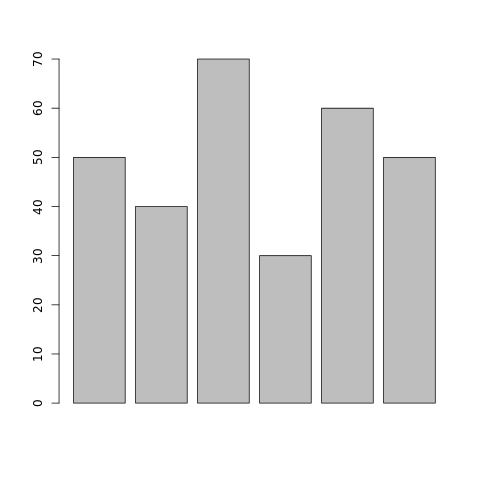
In the example below, a bar plot is generated using data present in vector students, which represents number of students studying different languages.
#creating dataset
students <- c(50, 40, 70, 30, 60, 50)

#naming the file
png(file = "barplot.png")

#drawing the barplot
barplot(students)

#saving the file
dev.off()
The output of the above code will be:
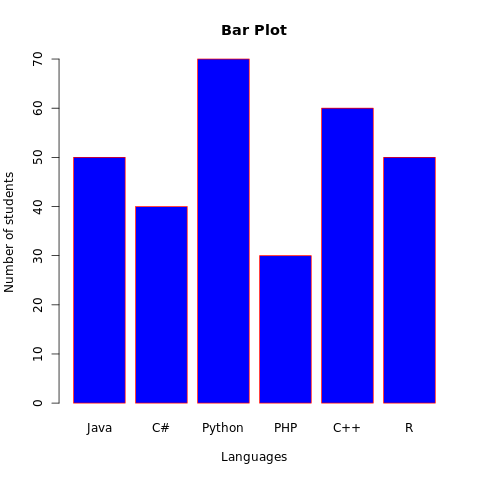
Example: Add features to bar plot
More features in the plot can be added using more parameters in the function, for example: to add title to the plot, main parameter is used and to add color, col parameter is used.
#creating dataset
students <- c(50, 40, 70, 30, 60, 50)
langs <- c("Java", "C#", "Python", "PHP", "C++", "R")

#naming the file
png(file = "barplot.png")

#drawing the barplot
barplot(students, names.arg=langs, main="Bar Plot",
        col="blue", border="red", xlab="Languages",
        ylab="Number of students")

#saving the file
dev.off()
The output of the above code will be:
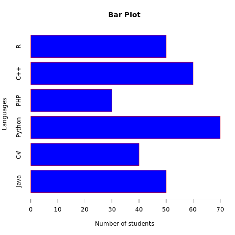
Example: Horizontal bar plot
To plot the horizontal bar plot, horiz parameter should be set to TRUE. Consider the example below:
#creating dataset
students <- c(50, 40, 70, 30, 60, 50)
langs <- c("Java", "C#", "Python", "PHP", "C++", "R")

#naming the file
png(file = "barplot.png")

#drawing the barplot
barplot(students, names.arg=langs, main="Bar Plot",
        col="blue", border="red", ylab="Languages",
        xlab="Number of students", horiz=TRUE)

#saving the file
dev.off()
The output of the above code will be:
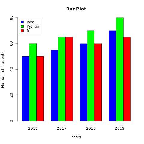
Example: Grouped bar plot
To plot the grouped bar plot (multiple bar plot), beside parameter should be set to TRUE. Consider the example below:
#creating dataset - number of students
#studying languages for last four years
st_java <- c(50, 55, 60, 70)
st_python <- c(60, 65, 70, 80)
st_r <- c(50, 65, 60, 65)
students <- rbind(st_java, st_python, st_r)

years <- c('2016', '2017', '2018', '2019')
colors <- c('blue', 'green', 'red')
langs <- c('Java', 'Python', 'R')

#naming the file
png(file = "barplot.png")

#drawing the barplot
barplot(students, names.arg=years, main="Bar Plot",
        xlab="Years", ylab="Number of students",
        col=colors, beside=TRUE)

#adding legend to the barplot
legend("topleft", langs, cex = 1, fill = colors)

#saving the file
dev.off()
The output of the above code will be:
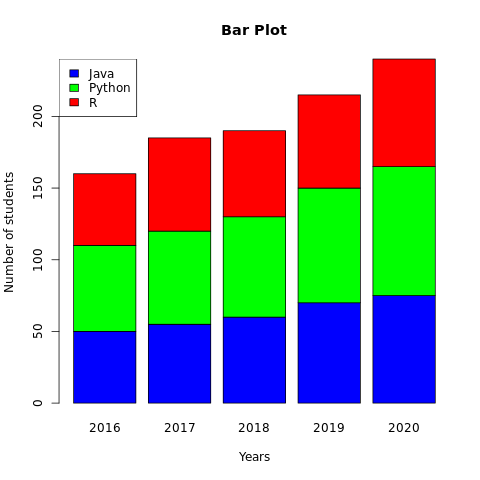
Example: Stacked bar plot
To plot the stacked bar plo, beside parameter should be set to FALSE. Consider the example below:
#creating dataset - number of students
#studying languages for last four years
st_java <- c(50, 55, 60, 70, 75)
st_python <- c(60, 65, 70, 80, 90)
st_r <- c(50, 65, 60, 65, 75)
students <- rbind(st_java, st_python, st_r)

years <- c('2016', '2017', '2018', '2019', '2020')
colors <- c('blue', 'green', 'red')
langs <- c('Java', 'Python', 'R')

#naming the file
png(file = "barplot.png")

#drawing the barplot
barplot(students, names.arg=years, main="Bar Plot",
        xlab="Years", ylab="Number of students",
        col=colors, beside=FALSE)

#adding legend to the barplot
legend("topleft", langs, cex = 1, fill = colors)

#saving the file
dev.off()
The output of the above code will be: